Why typography matters in branding
When we talk about branding, elements like logos, colour schemes, and imagery often take centre stage. However, one crucial component frequently flies under the radar: typography.
The fonts you choose for your brand are not just about making text readable; they carry emotional weight and convey subtle messages about your brand’s identity and values.
If you don’t choose wisely, it can drastically alter the perception of your message. How? Find out!
let’s talk about first impressions
We all know in every walk of life, first impressions matter.
The typeface you select can set the tone before a single word is read. Whether your brand is bold and assertive, sleek and modern, or warm and inviting, the right typography can instantly convey these qualities without you even realising. Just as a handshake can create a first impression, so can your font choice.
ok, and emotionally?
Yes, you read that right. Typography gives emotional resonance to your customers. Typography goes beyond aesthetics; it taps into the psychology of your audience.
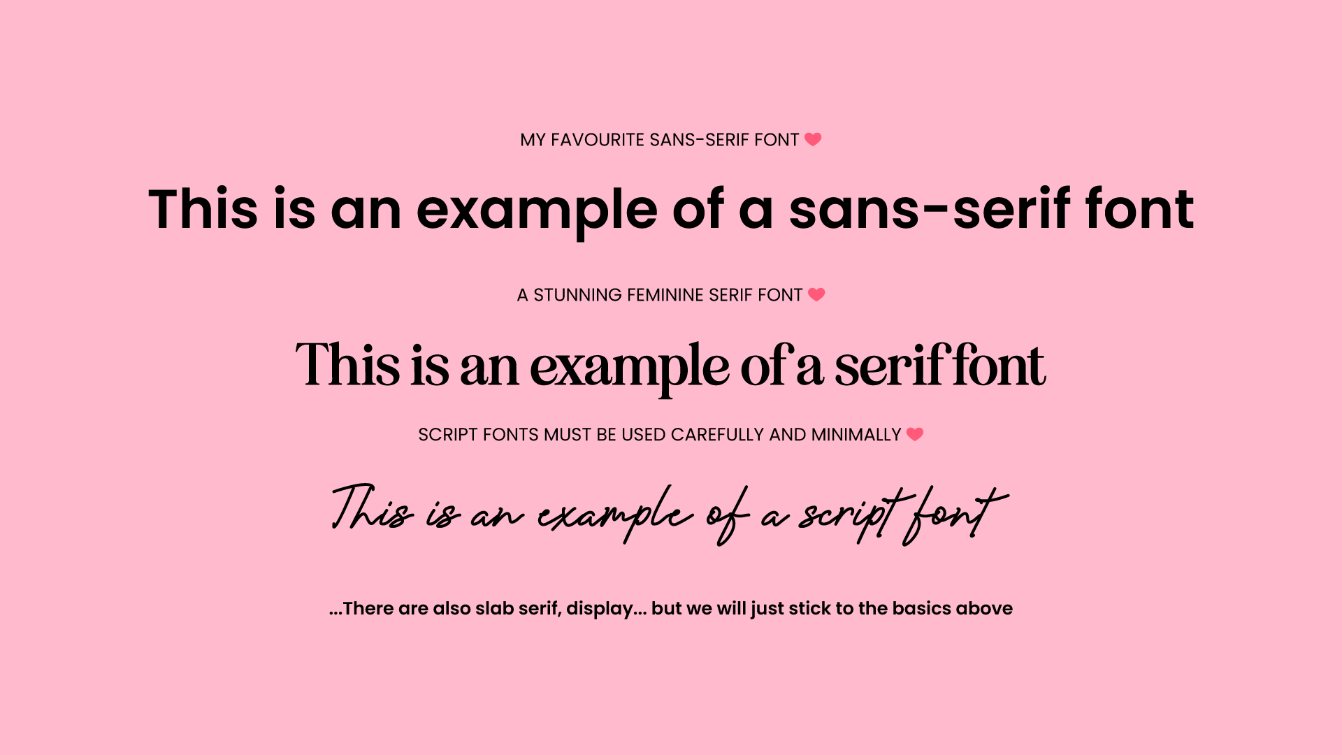
Serif fonts have small strokes or extensions at the ends of longer strokes in letters aka Times New Roman. They often evoke a sense of tradition and reliability and classic sophistication.
Sans-serif fonts are typefaces that lack the decorative lines or "tails" at the end of strokes that are found in serif fonts. The term "sans" comes from the French word for "without". These are fonts like Arial, Helvetica.. to name a few. These are seen as innovative, modern and clean and trustworthy.
Script fonts often have flowing and connected letterforms, and can be embellished with decorative elements. These can be perceived as elegant, romantic and feminine, depending on their style of course.
By understanding these associations, you can choose typography that aligns with the emotional response you want from your audience.
There are general ‘rules’ for typography, for example you would never see a tech company using a serif font for their logo - they want to appear innovative, trustworthy forward thinking and modern, therefore they would choose a sans-serif font. Just like a corporate law firm would not use a script font for their logo as they want to appear trustworthy, respected, serious and professional. A whimsical romantic font would not do the trick there!
consistency and recognition
Consistent use of typography across all brand touchpoints helps build brand recognition. When your audience sees your distinct typeface, they should immediately think of your brand. This consistency reinforces your brand identity and helps to create a cohesive experience.
the impact of different fonts
Here I am writing the exact same words, see how two different fonts present two different emotions?
Can you see how the left and right both convey different emotions, even though the colours and text is exactly the same?
Typography is a powerful tool in the branding toolkit. The font you choose can shape perceptions, evoke emotions, and create a consistent brand experience. As seen in the example above different fonts can send entirely different messages, so you have to be sure your fonts are sending the appropriate message to your customers. By thoughtfully selecting typography that aligns with your brand’s personality and goals, you can strengthen your brand identity and better connect with your audience.
Remember that every letter counts—literally. Choose your typography wisely, and let it speak volumes about who you are and what you stand for. Need some help?
If you’re not sure if the fonts you have chosen for your brand are hitting the spot, we can help! Maybe you have chosen some fonts that you’re not sold on so you keep changing them and trialling different ones to see which one sticks (hello, confused audience) - don’t worry this happens a lot.
Your brand could be on the right tracks but may need some polishing to get to the level it deserves. We offer a brand refresh package where we take a look at all of your elements including the font pairings and tweak as needed so that you’re sending the right message. We also ensure your colours are compliant (for accessibility and contrast effectively), make sure you have the logo variations you need, and create additional assets that you’re missing (illustrations or packaging designs for example)
Enquire with us to today to find out about our brand refresh package so that you can get a cohesive consistent epic brand identity in just two weeks.
Found this blog engaging? Dive into more insights on the benefits of investing in your branding! Check out our related blog on logo variations, what they are and why you need them. Expand your branding knowledge and stay ahead of the competition.


